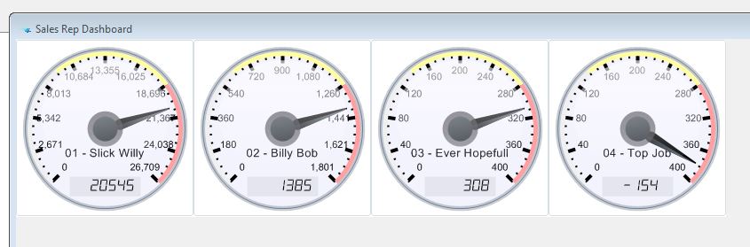
WinMAGI now has the ability to display various data sets as graphical representations. Showing data in a graphical format can help the users obtain a quick overview of what can be complex sets of data. For example, as per the picture below, we can quickly compare multiple sales reps sales versus budgets to see what sales reps are struggling to meet their sales targets.
If you have any data sets that would be easier to review on screen as a graphical gauge please contact us.